
Living Room Color Palettes Trending in 2026 You’ll Want Immediately
Your living room called. It wants to stop being “fine” and start being jaw-droppingly good. The right color palette does half the design work for you—seriously. Ready to see what’s hot for 2026 and how to make it work without repainting your ceiling at 2 a.m.? Let’s go.
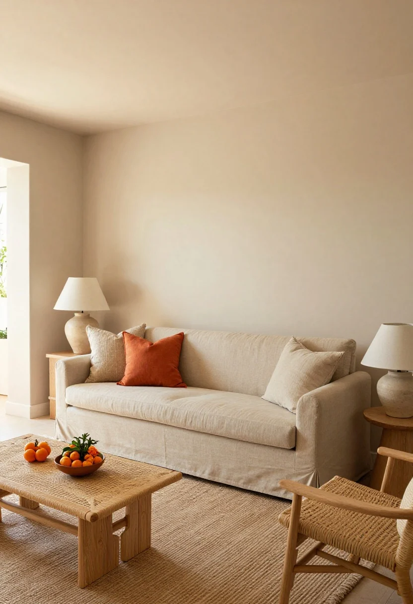
1. Sun-Drenched Neutrals With a Citrus Pop
© 2025 AI Illustrator — Inspiration Only
Think warm, sandy neutrals wrapped in sunlight—then drop in a zesty hit of citrus for life. Soft taupe walls, oat-colored sofas, and natural wood tones create calm. Add tangerine or lemon accents to wake it up. It’s like vacation, but with better Wi‑Fi.
Which Home Style Fits Your Space?
Answer 5 quick questions to find your perfect interior style and inspiration.
How to pull it off
- Base: creamy beige, mushroom, or warm linen.
- Accent: marigold, mandarin, or limoncello—small doses, big vibe.
- Materials: rattan, light oak, woven linen, matte pottery.
Pro move: Keep citrus accents below eye level (pillows, planters) so it reads chic, not cafeteria.
What to shop for: slipcover sofas, natural-fiber rugs, ceramic lamps, linen pillows.
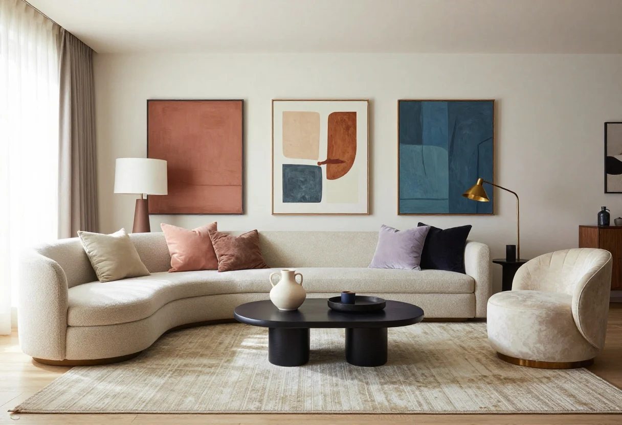
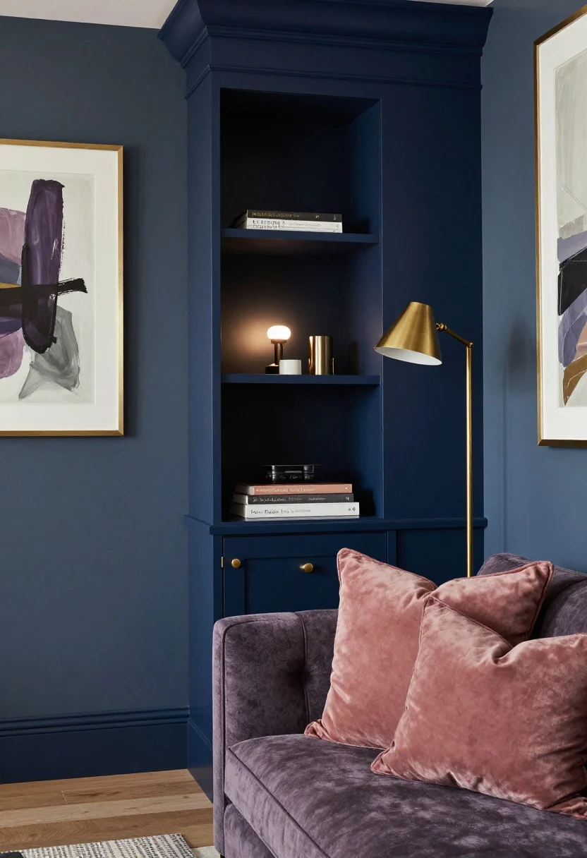
2. Heritage Blue Meets Modern Mauve
© 2025 AI Illustrator — Inspiration Only
Blue has range. This year it’s pairing its classic side with a moody mauve for a fresh, grown-up palette. Picture stormy navy or ink blue grounding the room, with soft mauve textiles and smoky lilac art. It’s romantic without going full Valentine’s Day.
How to pull it off
- Base: deep navy or desaturated denim on walls or a statement cabinet.
- Accent: mauve throws, lilac abstract prints, and a dusty-rose velvet cushion or two.
- Metal: brushed brass or antiqued gold for warmth.
Lighting matters: Blues absorb light. Layer table lamps and picture lights so it reads luxe, not cave.
What to shop for: velvet cushions, framed art prints, brass floor lamps, textured throws.
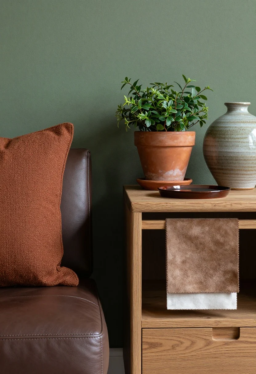
3. Earthy Greens With Chocolate And Clay
© 2025 AI Illustrator — Inspiration Only
Green isn’t going anywhere—2026 doubles down with richer, grounded tones. Think olive or moss paired with chocolate brown and terracotta. The effect is cozy, textural, and quietly sophisticated, like your favorite trail mix but for the eyes.
How to pull it off
- Walls: olive, laurel, or sage with a bit of gray.
- Contrast: milk-chocolate leather, rust pillows, terracotta planters.
- Texture: boucle, suede, hand-thrown ceramics, raw wood.
Styling tip: Add one glossy element (a lacquered tray or shiny side table) to keep it from feeling too rustic.
What to shop for: leather ottomans, terracotta pots, boucle accent chairs, ceramic vases.
4. Soft Black And Bone With High Contrast
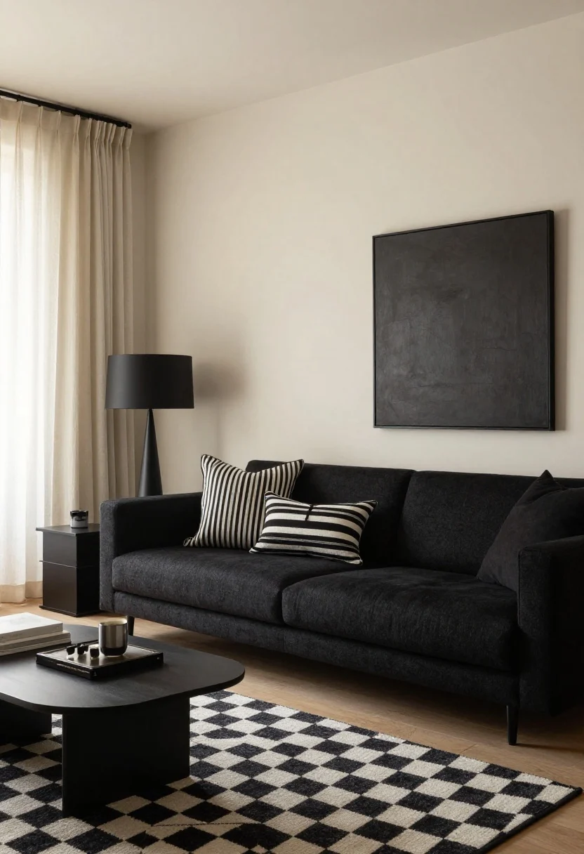
© 2025 AI Illustrator — Inspiration Only
Monochrome, but make it livable. Swap stark white for bone and harsh black for soft black (charcoal, graphite). The contrast stays chic, but the edges feel warmer. Perfect if your style is “minimalist, but with a pulse.”
How to pull it off
- Base: bone or alabaster walls with warm undertones.
- Anchor: charcoal sofa or soft-black media cabinet.
- Pattern: micro-stripes, checkerboard rugs, or block-printed pillows.
Balance the contrast: Repeat black elements three times (lamp, frame, side table) so it looks intentional, not random.
What to shop for: checkerboard rugs, black metal side tables, linen drapes, oversized wall frames.
5. Digital Lavender With Cloud White
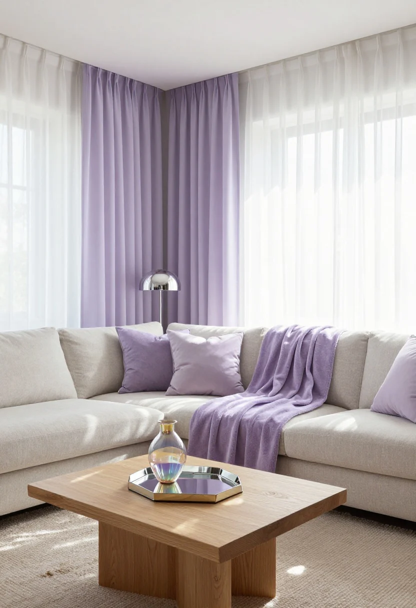
© 2025 AI Illustrator — Inspiration Only
Call it the wellness palette. Digital lavender is ethereal, slightly futuristic, and oddly calming. Pair it with cloud white and touches of chrome or pearl finishes, and your living room feels like a spa that also streams your favorite shows.
How to pull it off
- Walls: keep them white or ultra-pale lavender on just one feature wall.
- Textiles: plush lavender throw, lilac gradient pillows, gauzy curtains.
- Shine: mirror, chrome lamp, or iridescent vase for that airy lift.
Keep it grounded: Introduce a natural element—pale oak or jute—to stop it from floating away into the metaverse (FYI, that’s a thing).
Which Living Room Color Palette Fits You Best?
Discover the palette that reflects your style — take our free quick quiz and get instant decor inspiration!
Take the Quiz NowWhat to shop for: chrome lamps, boucle sofas, mirrored trays, airy sheers.
6. Spiced Plum With Burnished Copper
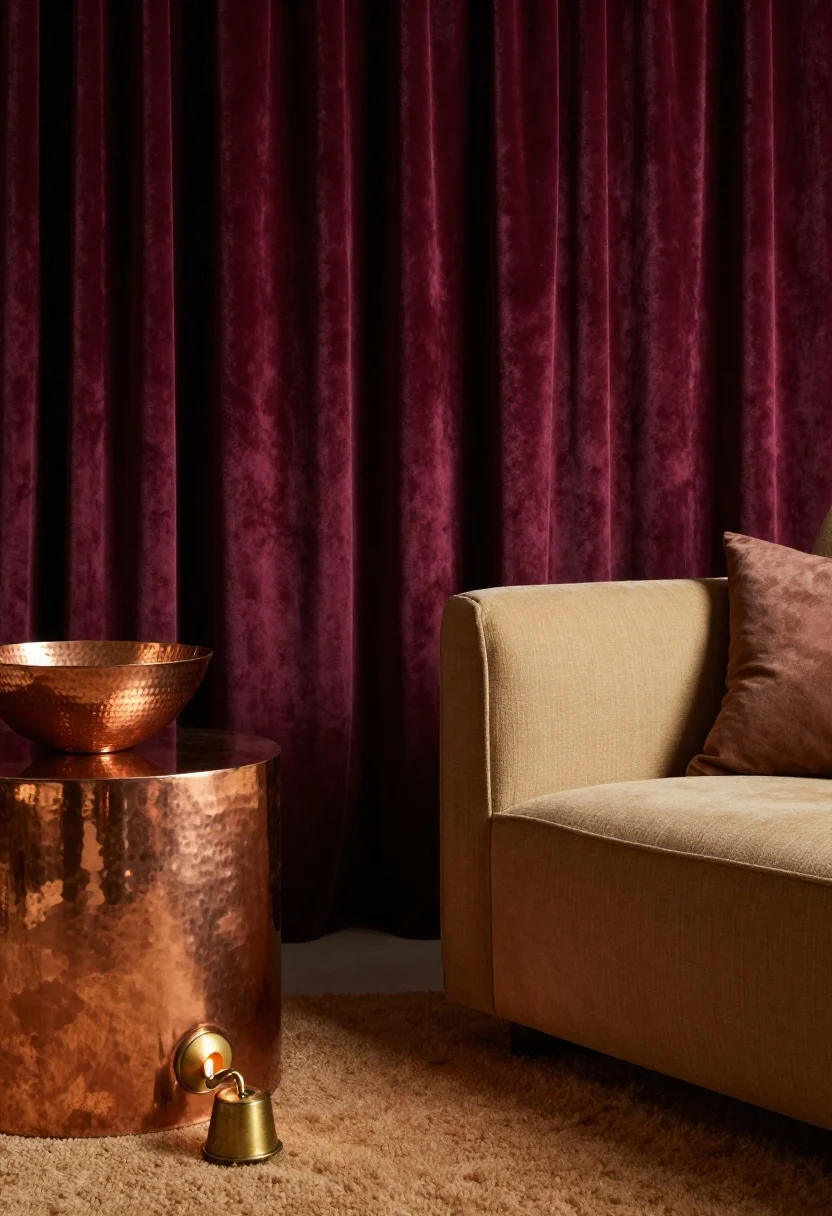
© 2025 AI Illustrator — Inspiration Only
If your living room wants drama, this is the moment. Spiced plum—a deep wine with brown undertones—looks stunning with burnished copper and warm neutrals. It screams boutique hotel without the mini-bar prices.
How to pull it off
- Accent wall or drapery in spiced plum to frame the space.
- Metals: hammered copper bowl, aged brass sconce, or a copper-toned side table.
- Neutrals: camel, latte, and parchment to soften the palette.
Scale matters: Use plum big (drapery, wall) or small (pillows, art matting). Mid-size pieces can feel muddled.
What to shop for: heavy drapery panels, metallic side tables, wool rugs, sculptural table lamps.
7. Coastal Charcoal With Sea Glass Accents
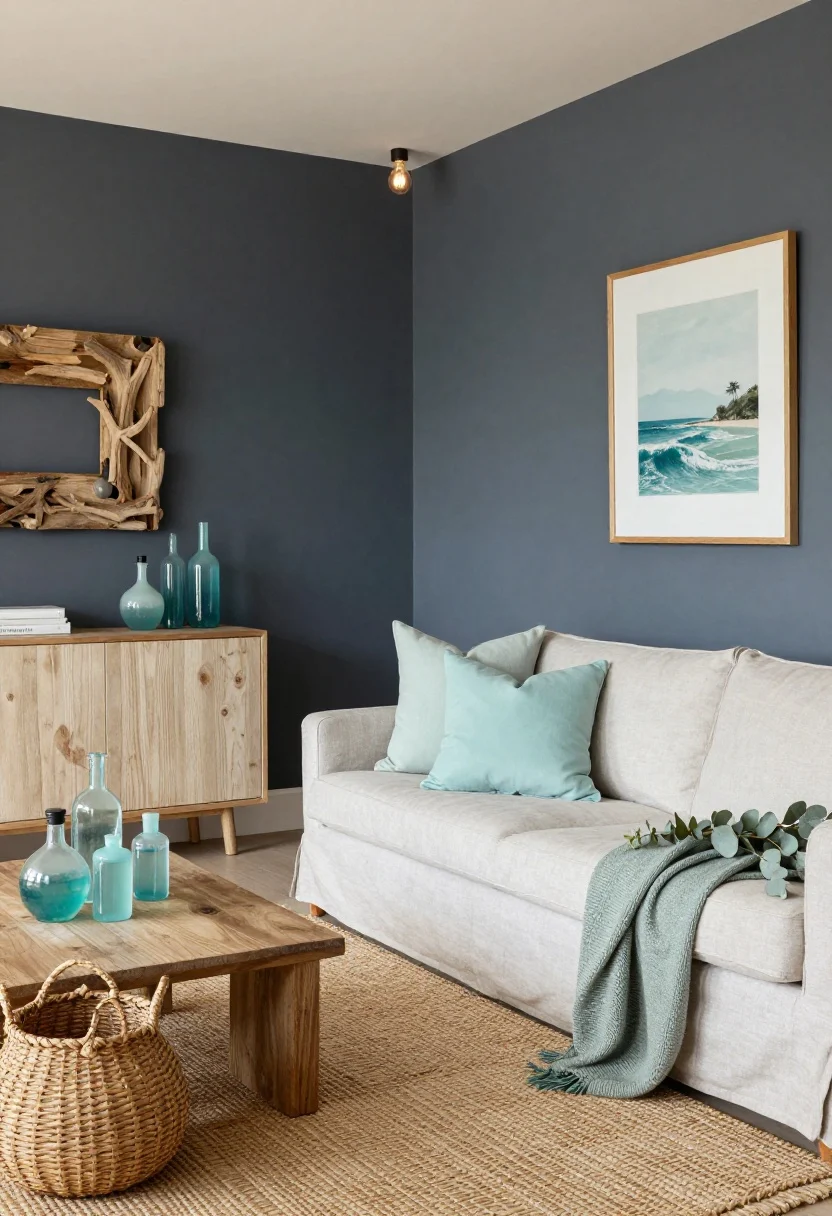
© 2025 AI Illustrator — Inspiration Only
Coastal is growing up. Trade baby blues for a moody coastal charcoal and sprinkle in sea-glass shades—eucalyptus, pale aqua, and mist. It’s beachy without the “I own a lighthouse” energy.
How to pull it off
- Walls: soft charcoal or deep gray-blue—matte finish keeps it modern.
- Accents: sea-glass bottles, pale aqua pillows, eucalyptus-toned throws.
- Natural: driftwood frames, woven baskets, seagrass rugs.
Light it right: Add warm bulbs (2700–3000K) so charcoal reads cozy, not cold. Trust me, it’s a game changer.
What to shop for: seagrass rugs, glass vases, linen slipcovers, woven baskets.
Quick Styling Cheats That Work With Any Palette
- Test swatches large and vertical—paint two coats on poster board and move it around the room.
- Match undertones. Warm wall = warm neutrals; cool wall = cool metals. Clashing undertones = instant “why does this look off?”
- Use the 60/30/10 rule: 60% base, 30% secondary, 10% accent. IMO, foolproof.
- Repeat colors in at least three places for cohesion.
Small-Space Tips
- Go tonal. Similar shades expand visually.
- High-contrast patterns in small doses—like a pillow or art—add snap without chaos.
- Reflect light with mirrors or glossy accents if natural light is scarce.
Texture Pairings To Elevate Any Palette
- Matte walls + nubby linen = quiet luxury.
- Velvet + metal accents = glamour without trying too hard.
- Boucle + warm wood = cozy-modern perfection.
Pick one palette that fits your vibe and run with it. Your living room doesn’t need a full gut—just a few strategic color choices and texture upgrades. Start small, edit often, and watch the whole space click.
FAQ
Q: How many colors should I use in one living room?
A: Stick to three main colors (base, secondary, accent). You can add a couple of neutrals as support, but keep the 60/30/10 balance.
Q: Do I have to paint the walls to try a new palette?
A: Nope. Swap textiles, art, and decor first. If you love it after two weeks, then commit to paint.
Q: What finish should I choose for living room walls?
A: Go eggshell or matte for most walls—low sheen hides imperfections and looks elevated. Use satin on trim for a subtle contrast.
You’ve got the palettes. Now grab a couple of swatches, a bold pillow or two, and make 2026 your living room’s best year yet.
Shop the Look on Amazon
Disclosure: As an Amazon Associate, this site may earn from qualifying purchases.
These product categories fit this article and give readers an easy next step when they are ready to shop.
- Neutral Base — Grounds sun-drenched neutrals with warm texture
- Layered Lighting — Brightens heritage blues without harsh glare
- Earthy Accents — Adds clay warmth to green and chocolate schemes
- High Contrast — Delivers soft black and bone pattern balance
- Luminous Shine — Elevates digital lavender with airy reflectivity
2 Comments
Comments are closed.