
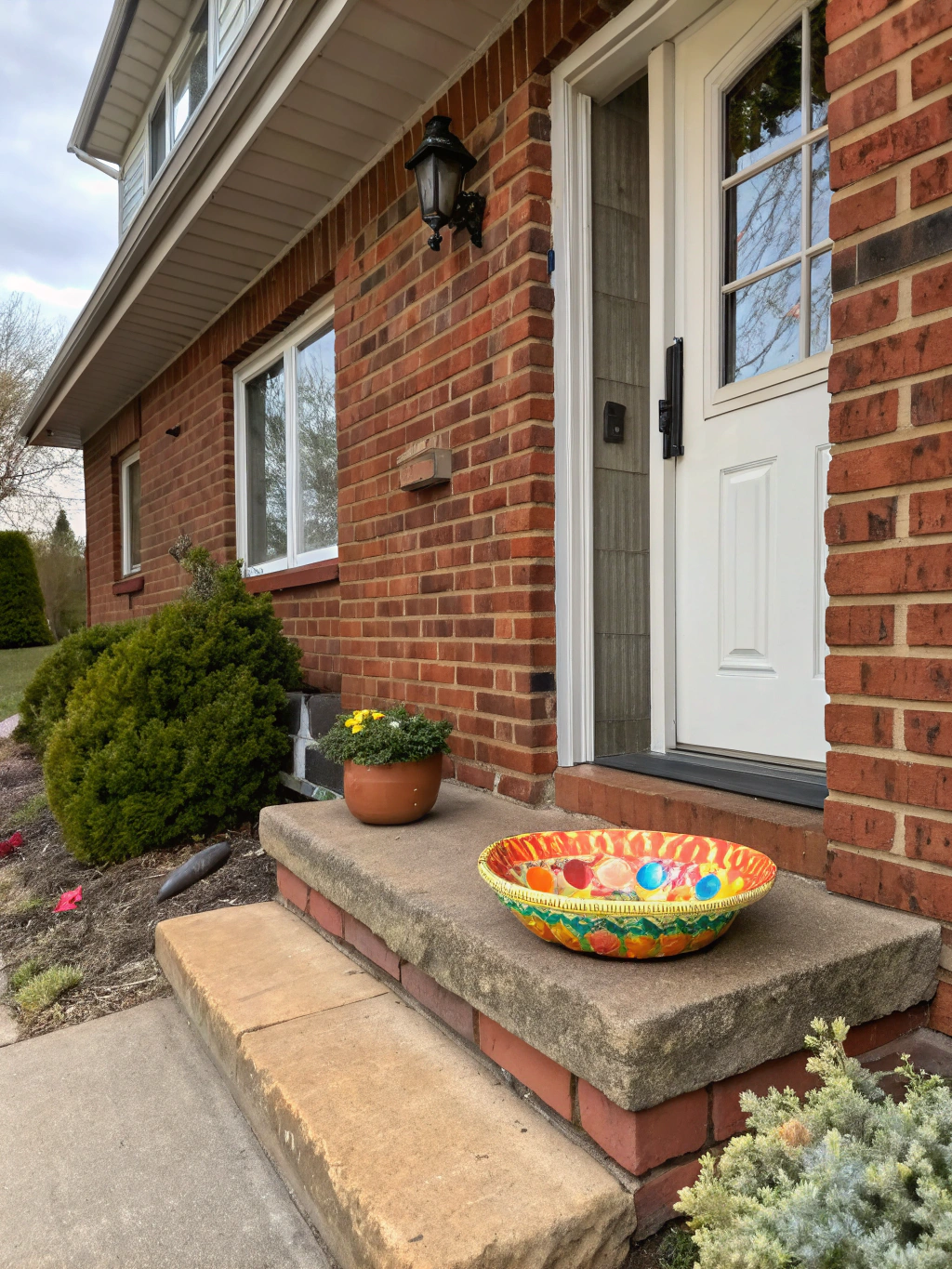
Brick House Exterior Color Schemes That Boost Curb Appeal
Brick House Colors: Exterior Paint Inspiration
So, there I was on a Sunday morning, still in my pajamas—coffee perched precariously on the stack of books balancing on a wobbly side table, and my cat, Mr. Whiskers, giving me the side-eye as if judging my life choices. My gaze drifted outside, where the faded red of our brick house made it look like it was in desperate need of a makeover. It got me thinking: what colors could breathe new life into this sturdy old thing? With a little research (read: Pinterest scrolling) and a dash of daydreaming, I realized there’s a whole world of exterior paint inspiration, especially for brick houses.
© 2025 AI Illustrator — Inspiration Only
Which Home Style Fits Your Space?
Answer 5 quick questions to find your perfect interior style and inspiration.
Now, if you’re anything like me, the thought of choosing a new color for your house can feel a bit like choosing a college major—overwhelming and full of potential “what ifs.” But don’t fret! I’ve spent way too many mornings, like today, diving deep into color palettes, and I’m here to share what I’ve learned about revamping a brick home’s personality with a splash of paint (or ten).
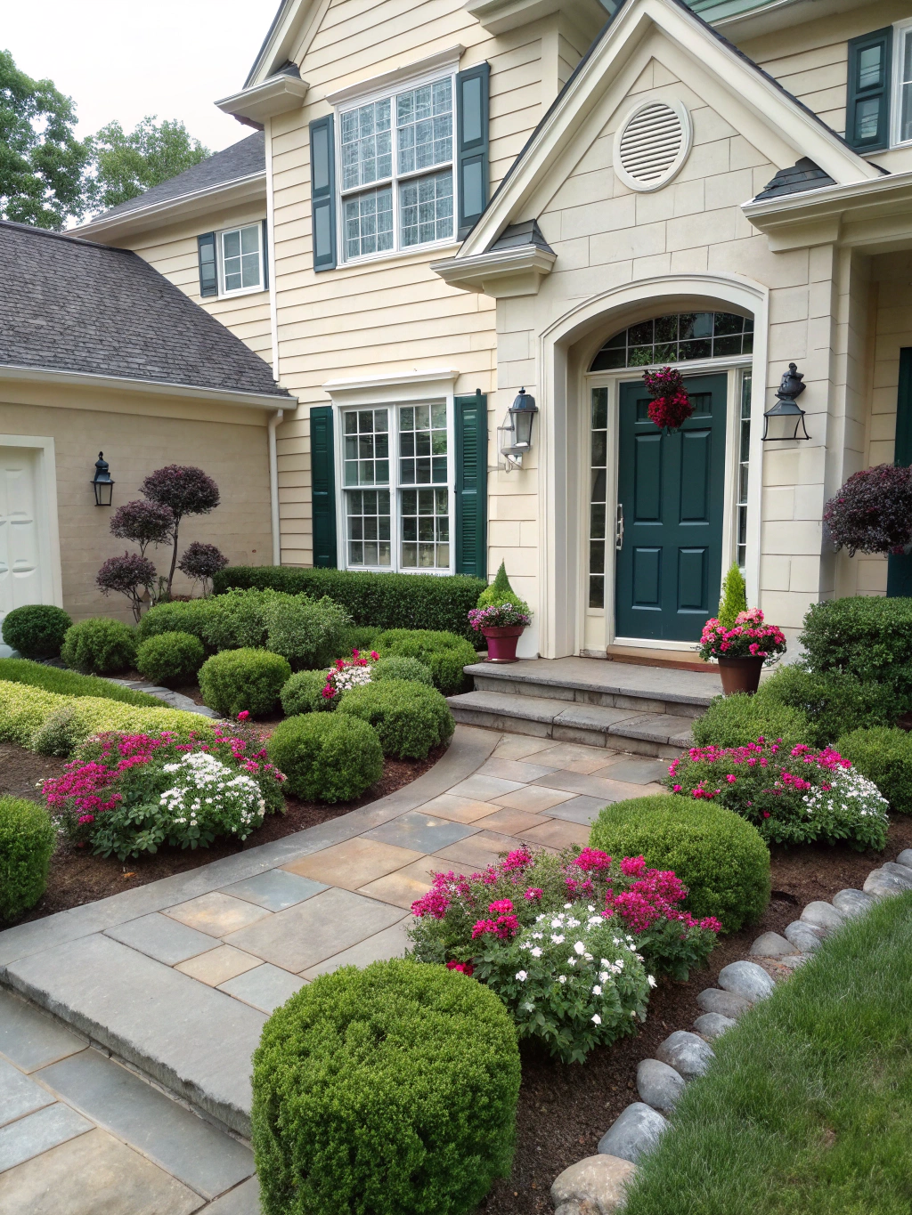
Embrace the Classics: Whites and Creams
Let’s kick things off with a classic. There’s something incredibly soothing about a white or cream exterior. Imagine this: a crisp white brick house, the late afternoon sun cascading over the smooth surface like a warm hug. You have bright blue shutters and maybe a cherry-red front door. Just picture it! What’s even more fun is that the classic white allows for so much flexibility in decorating your outdoor space.
Every season could feel like a new celebration! Fall? Toss some vibrant pumpkins on your porch. Spring? Blooms in every color will pop against that divine white backdrop! If you’re aiming for a cozy, inviting vibe yet need some exterior paint inspiration, try a creamy hue—it’s hard to go wrong with that palette.
Personal Tip: If you’re worried about maintenance, look for paint brands like Benjamin Moore or Sherwin-Williams that offer durable, outdoor-rated paints. Trust me; you want something that can withstand the elements (and your neighbor’s dog who thinks your garden is his personal restroom).
Add a Dash of Color: Soft Pastels
Okay, let’s get a bit adventurous! Soft pastels—think mint green or powder blue—are showing up everywhere, and they bring a fresh, lively feel. Imagine your classic brick home clad in a soft, minty green, surrounded by a sea of flowering hydrangeas. It has that dreamy, vintage vibe that feels like waking up in a whimsical cottage. And yes, I can practically smell the fresh blooms just thinking about it.
These colors can really warm up the look of your home. I once saw a pastel pink brick house in a neighborhood near mine that genuinely felt like walking into a fairytale. There’s just enough fantasy to make you smile without it feeling over-the-top. Plus, pastel colors work surprisingly well with neutral accents. Add a dark wood door, and boom! This dreamy exterior paint inspiration now has depth.
© 2025 AI Illustrator — Inspiration Only
Bold and Beautiful: Jewel Tones
For the brave hearts out there, jewel tones can transform your brick house into a stunning piece of art. Just picture a rich emerald green or a deep navy blue seamlessly enveloping your home. You’d stroll by and do a double-take—because who wouldn’t want a majestic, jewel-toned brick house?
A jewel-toned home invites personality. Think of those colorful flowers on the porch or playful outdoor furniture in bright yellows or oranges against a backdrop of dark brick. It’s modern, sophisticated, and let’s be honest—a bit of a statement. If you want something that turns heads and garners plenty of compliments, jewel tones are your ticket.
Fun Idea: If you’re feeling creative, why not try an ombre effect? Start with a deep navy at the bottom and work your way up to a lighter shade, creating depth and intrigue. Channel your inner Picasso!
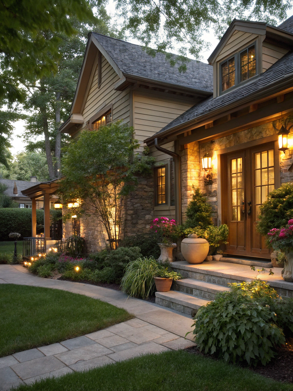
Go Earthy: Warm Neutrals
Now, let’s talk about warm neutrals. These are the comforting, laid-back vibes that make your home feel like a sanctuary. Soft taupe or warm beige? Yes, please! It has a way of blending into the landscape that feels gentle and welcoming. Imagine stepping outside to the smell of freshly brewed coffee (or, you know, the leftover pizza from last night) and being serenaded by birds flitting around your warm neutrally painted home.
Warm neutrals also offer an opportunity for beautiful wooden accents—a rustic bench, maybe some beautiful clay pots. My favorite idea here? Introduce a pop of color with planters that contrast beautifully against that neutral background. It keeps things simple yet inviting. Trust me, it takes your curb appeal to the next level!
© 2025 AI Illustrator — Inspiration Only
Play With Contrasts: Light vs. Dark
Contrast can bring drama to your home’s exterior like nothing else. Picture a dark brick home adorned with bright white trim. It’s striking and sophisticated, right? When those two tones work together, they create a visual punch that feels upscale and chic.
Combining light and dark can frame architectural details wonderfully. If you’ve got beautiful columns or shutters, painting them a contrasting color can enhance their features. It transforms ordinary elements into highlighted statements. Think of it as getting all dressed up for an occasion—even if that occasion is just checking the mail!
Which Living Room Color Palette Fits You Best?
Discover the palette that reflects your style — take our free quick quiz and get instant decor inspiration!
Take the Quiz NowA Splash of Details: Accents and Trimmings
Okay, so you’ve chosen the main color for your brick house. Fabulous! But don’t forget about the cake decoration—err, I mean, the accents! Accent paint can take your exterior from cookie-cutter to uniquely you.
This is where you can let loose—bright, unexpected colors for your front door, mailboxes, or change out the house numbers to something funky and fun. I painted my front door a sunny yellow last summer. It led to many impromptu conversations with neighbors—mostly compliments and some delightful debates on color theory!
And, I’ll admit it: keeping the colors cohesive can be a bit of a balancing act. I suggest making a color board at home to ensure that the accent colors align with the main house color. Swatches are your friends here!
© 2025 AI Illustrator — Inspiration Only
Seasonal Touches: Adapt as You Go
Lastly, remember that your home color doesn’t have to be static—it can adapt with the seasons! I mean, who doesn’t love switching it up? You can have your main color but bring in seasonal decor that aligns with it.
For autumn, deep grapes and burnt oranges can amplify a warm-tone brick. At Christmas, snowflake accents against a dark exterior can create that cozy, festive feel. In summer, bright flowers can add a pop. Basically, your house can transform with the seasons!
Wrap-Up Thought: Seasonal change is a great excuse to keep rethinking your outdoor aesthetics, so find exterior paint inspiration that feels timeless yet adaptable.
Final Thoughts
So there you have it—my musings on colors for brick house exteriors while lounging in my pajamas. It’s crazy to think an update could breathe new life into the home you’ve lived in forever, isn’t it? Every color choice tells a story, and now, with all these tips, you can curate the perfect narrative for your brick abode—turning it into a warm hug of a home for you and yours.
Go on, grab your coffee (or tea, if you must), and give your house a new voice! Who knows, maybe it’ll even inspire your neighbors to step out of their comfort zones. When you’re ready, take that bold step and let your brick house shine!